SENOVARTI
Client
Senovarti
Year
2022
Area
Designer
Anisa Rizqia, Jo, Nabil, Tia
Contractor
Bejam
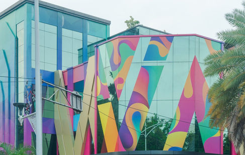
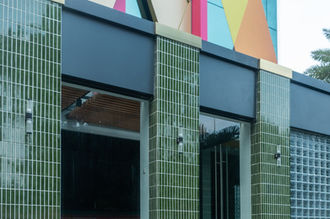
Dont underestimate the power of colour. It no need to change the shape of the old building. By re-colour and give some accents could get the new looks.
Colour represents the company's brand as the venture in creative and art industry so much as well as logogram they have. Like a chameleon, the logogram is camouflaging beyond the placed on the facade but not obvious to be seen so it placed on the glass surface full of vines-highway-full of colour background.
On far away, it just looks like the vines-highway background the scratched.
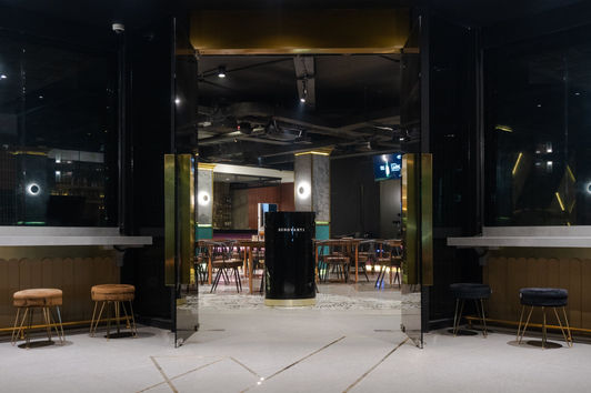
The building not just about colour and creativity, it's should be glamour to be one of the best night club-bar in this industry.
Gold metal cladding show that glamour. The waving shape is extracted from the hologram itself.
Year:
Year:
2022


